For today’s post we take a look back at a project we did a few years ago-this cute and charming East Side Bungalow. For more about this project visit our project recap page here. All materials used in this house can be found on our stalk n shop page here.

The East Side of Austin is popping! It seems like there’s a new condo going up daily and a trendy chicken place on every corner of this rapidly gentrifying area. You may remember we profiled the Eastside (and one of our favorite local breweries-the Blue Owl) in a previous video on the Austin Flipsters’ Youtube channel.
https://www.youtube.com/embed/LlkzZ5wRgcw?autoplay=0&mute=0&controls=1&origin=http%3A%2F%2Fzcm.uzz.mybluehost.me&playsinline=1&showinfo=0&rel=0&iv_load_policy=3&modestbranding=1&enablejsapi=1&widgetid=5
Kombucha joints aren’t the only thing on the rise in East Austin. Prices are as well! Thanks to an influx in corporate development (HEB is locating their digital headquarters here) and access to popular restaurants and bars there’s no shortage of Austinites clamoring to live East of Downtown.
More demand=more money to be made by developers and flippers (that’s us) in the area. Especially since many properties are zoned for A and B units. This means you can buy one house, tear it down and build (and sell) two properties on the same lot.
Our charming craftsman was located in Boggy Creek an area just East of Downtown. It had 3 bedroom, 2 bathrooms and 1048 square feet. We purchased the property for $260,000.

We did have to do some foundation work with this one. Even though it was built in 1990, it did have some movement. Because it was a pier and beam foundation we were able to address this movement with a few added cross beams.
Flipping 101: neighborhood and market should dictate your design choices. Since we primarily flip entry-level homes in South Austin we haven’t been able to be as bold with our design choices as we would like. This project gave us the leeway to be a little funkier. Which we loved.
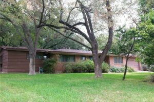
Let’s start with what the property looked like when we first purchased it.

Cute right? Just needed a little cosmetic updates to the exterior to give it that East Austin vibe.
Here’s the porch before:

And after:

To give the bungalow a fresh and updated exterior, we added new modern windows, an industrial-inspired front light, a new front door (painted a deep charcoal) and added some modern house numbers running vertically to the left of the door.
We also added horizontal slatting to the front and side of the porch to give it a clean urban feel. The side lattice also adds an element of privacy.
Basic landscaping (including the removal of some large shrubs) gives the property a fresh vibe.
We updated the exterior paint colors as well. We chose a Benjamin Moore’s Bracken for the siding and Benjamin Moore’s Polo Blue for the trim. We used Behr Harbor Grey to stain the deck and railings.
Alright now moving inside to everyone’s favorite part of the house-the kitchen. The previous kitchen was a true galley style kitchen with dated cabinets, white appliances and laminate countertops. We knew we wanted to improve the layout, and update the finishes.

Ta-da!

We removed the wall behind the stove opening up the entire space and creating a modern open-concept with easy access to both the dining and living spaces. We added an island painted in a fun bright turquoise (Thai Basil) with room for bar stools to add style and function. The stove and cook top are integrated into the island and we added a modern stainless-steel vent hood. All new white cabinetry (painted Silky White) and white quartz counters give a fresh clean look. Stainless steel appliances finish the updates. We originally planned to tile the back of the island in a fun cement tile but decided to go with the paint to save costs. The layout is still a galley but a much brighter, modern and more functional one!
Dining room before: 90’s cottage vibes

And after:

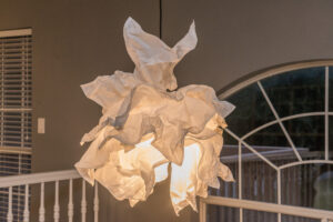
We updated this small space with new windows (including a contrasting wood trim), new paint and modern light fixture. We used a smaller bistro sized table to make the small dining space feel larger. The modern urban staging also help give the home a trendy look. We also shrunk the size of our pendant light in this space to keep the scale. We originally planned a much larger West Elm fixture but it overwhelmed the space and we traded for this smaller one.
Living room before was crowded with oversized furniture and it’s size was borderline unusable (do you see the tv in front of the window??).

After:

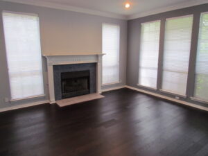
If you think this space looks bigger-you’re right. In general when flipping houses we like to stick to 3 bedroom, 2 bath properties. This is the most sought after combination and the houses that tend to sell the quickest. With this property we broke our own rules by turning it from a 3/2 into a 2/2. We took down the walls to one of the bedrooms and combined that space with the living room to create a large, functional gathering spot.
We took a gamble with that decision but what we were betting on is our buyer. Because this area is so transitional and popular with the millennials we figured the buyer would be young and urban and would place more value on functional living space than an extra bedroom.
New windows add much needed light. We replaced the ceiling fan with a new modern pendant and staged with modern furniture. The floors (dark laminate) were replaced throughout the home with high-contrasting hickory. The natural variation in this wood makes for a bold feeling design.
Guest bedroom before: small space feels even smaller with large furniture and low-hanging fan.

Guest bedroom after:

We upgraded the flooring in this room, added neutral paint as well as an wallpaper accent wall in a herringbone pattern. If you’re looking to add a wallpaper accent wall to your home but are having commitment issues we recommend vinyl peel and stick available at sites like wayfair. We added a fan made for low ceilings and staged the space as an office. Since again we were betting on a young, professional buyer.
Master bedroom befo

And after:

Same treatment as the guest room with floor, paint and ceiling fan upgrades. We originally planned a shiplap accent wall in this space but decided to nix for budgetary reasons.
Guest bath before:

And After:

Modern updates to this small space include new vanity, vanity light, modern round mirror and bold tile. We felt like a bold pattern would work because the space was so small there would not be an overwhelming amount of it. We also liked that it gave this fairly plain jane bathroom a dose of personality. For functionality we carved our a storage niche.
Master bath before:

And after:


Again this was a tight space. We added a cool wood floating vanity to free up some space visually. We tiled the entire shower and one wall of the bathroom in a clean white subway tile. We also added some bold cement tile in this space for some character. A built in shower niece adds functionality while the copper bowl sink ups the style factor.
Overall this was a great project. The house itself wasn’t huge which helped keep renovation costs down (although we did spend $75,000 on updates in this one). The best part of this whole project was that the property went fast-we were under contract in 4 days and accepted an offer of $415,000 for the property-which if you’re doing the math at homes means we walked away with a cool $80,000 profit before closing and holding costs.
Thanks for following along. We hope to do more of these trips down memory lane in the future.
Until next time.

 Homemade


